 Remember when I went all gung-ho on digital scrapbooking? Well, I have stuck with it (it was a New Year’s resolution, you know).
 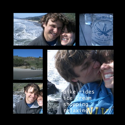 I did decide to go a different direction in the design…I originally was using scrapbook elements but got overwhelmed with getting it to look right. It suddenly was becoming too familiar with regular scrapbooking…which was why I gave it up.
 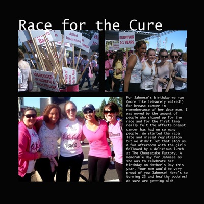 Instead I decided to go with a more streamlined look. I am really happy with the clean lines. Appears more book-like and makes the color of the pictures pop off the page (yet another reason why I love black and white anything).
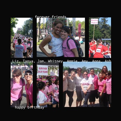 It is also one million trillion billion times easier than working with the scrapbook elements. I just fit everything into a square, throw in some phrases, and it is complete! So much faster and looks a lot better than what I was coming up with.
 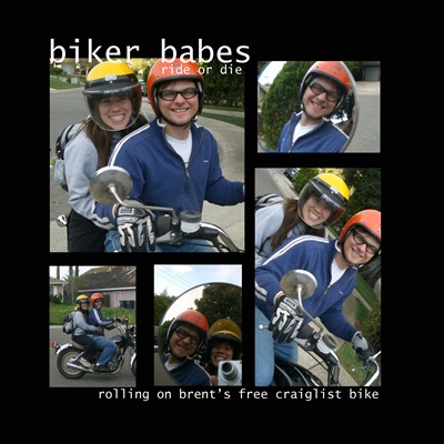 The 411: I use Adobe Photoshop Elements 7.0 to make the page on the black background. Save it as a picture and just drag and drop it into the Blurb software. More detailed info on blurb and why I have chosen them can be found HERE.
 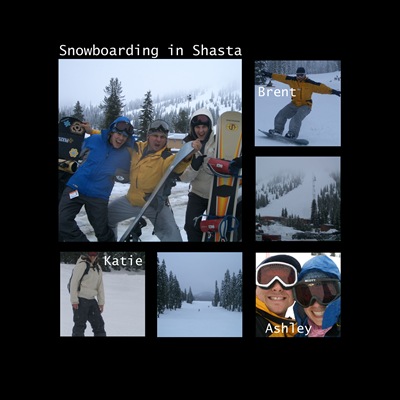 I am actually all caught up for 2009 so far (except for Hawaii) which is amazing for me. I think I am going to stick with it. I will keep you updated when it comes to ordering the book…but that will be a couple months from now.
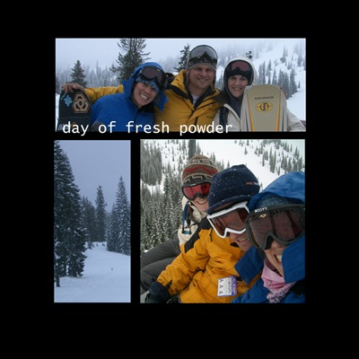 Questions? Feel free to email me. THIS POST really helps and read all the comments as well…lots of good tips and free downloads from readers.
 What do you do with your pictures?


I am so bad with keeping up on books. I started the "first year" book when my daughter was born. It's almost done??? She's 5. And I now had 2 other children. (Their photos are in boxes and on disks) Urg!
ReplyDeleteI think it's awesome! I never got into scrapbooking...I need instant gratification! Now I may try this method to save all our fun with the kids! BTW..you are just the cutest! I love seeing you in pics!!
ReplyDeleteThat looks really great. I hear ya with the digi elements being just as overwhelming! I may have to try something like this in the future. As it is, all my pics just sit on the computer and taunt me. :)
ReplyDeleteThat looks great. I actually just got a photobook from Shutterfly because they were offering a free one. I just used their program for making the layouts, so it is pretty simple but it works. Now I have something to show for my trip to Europe in may!
ReplyDeletelove the streamline look...very cool. scrap booking is cute, but what you did here has a more modern feel. LOVE IT!
ReplyDeleteHey, Ashley! I love your digital scrapbook pages. :) I'm still an old-school scrapbooker, but I haven't touched my stuff in months. I have a LOT to do...like an entire 1 year album for my 17 month old, and there are several years missing somewhere for the rest of us. ;) I try not to get overwhelmed...I don't scrapbook every little occurrence-just the big stuff. ;)
ReplyDeleteI really like the clean lines of the black and white. I think I'd need to stick to that too, or I'd be out of control with all the embellishments. ;)
That looks awesome. I've been wanting to get into digital illustration.
ReplyDeleteLooks great! I think I could maybe handle it this way. I usually post some on my blogs, then send them to my mom to scrap for me. Scrapping stresses me out.
ReplyDeleteI love how that looks! You have inspired me to giv eit a try! Thanks once again Ashley! You rock!
ReplyDeleteI have no time for anything other than life right now. But I do wish I could do this. Maybe once things calm down I could really enjoy this. Looks so beautiful!!
ReplyDeleteThis is great info, Ashley! I have tried digi-scrapping but like you, the elements get overwhelming and trying to make it all flow just takes a lot of time. I love your simple approach to it! I'm definitely going to try this.
ReplyDeleteI'm usually good about ordering pics and putting them in photo albums but am way behind at the moment - as in a year behind. Eek!
Your pages look great, Ashley! I wonder, do you print them, or do you get a book made at Kodak or Shutterfly or something? I've been getting mine made into those books. They are great and make great grandparent gifts.
ReplyDeleteAh, you were at Stinson Beach! It must be quite fantastic there..., only know it from the movie Basic Instinct I.
ReplyDelete